nieuws
Bekijk de DOOM Art Gallery met commentaar van de kunstenaars
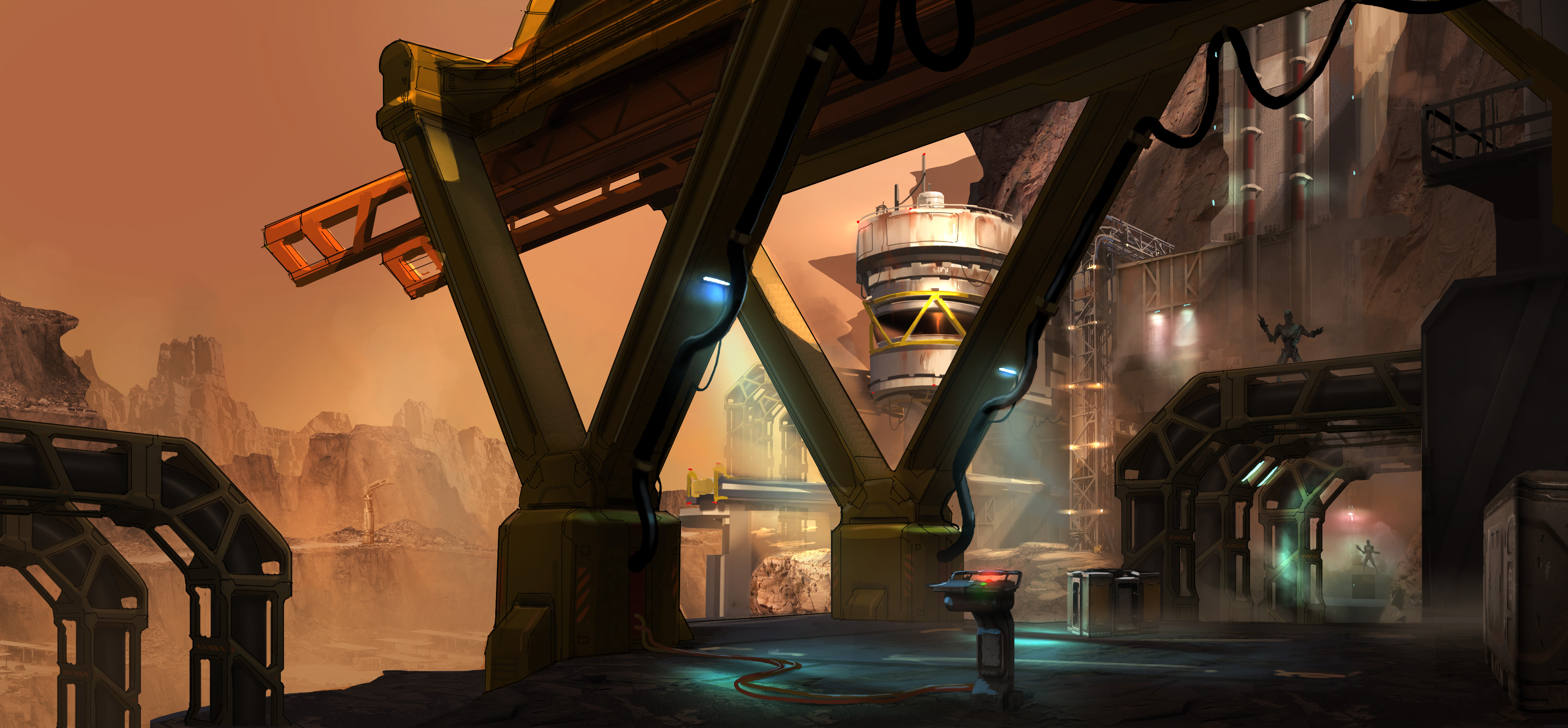
Zojuist is een uitgebreide DOOM Art Gallery onthuld, gepaard met commentaar van de kunstenaars achter de werken. De werken richten zich op de verschillende omgevingen van DOOM en zien er ongelooflijk indrukwekkend uit. Hieronder vind je alle afbeeldingen, inclusief commentaar.
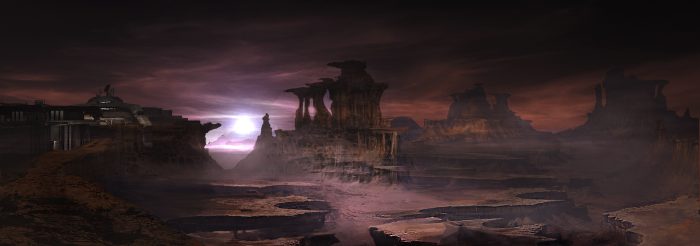
Ryan Watkins – Mars Vista
“This image was made to start exploring the Mars vista surrounding the UAC facilities. The idea was that the landscape has been decimated by time. Lakes and oceans have disappeared leaving behind layers of rock that have been sculpted and deformed by constant wind. The odd colors of the setting sun are to give the player a sense of unease and that something is not quite right with this world.”
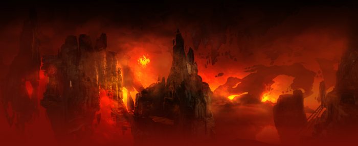
Ryan Watkins – Hell Vista
“Visualizing something as abstract as Hell is very difficult; everyone and every culture has their own version of it. Here, Hell is a fractured world where pieces of other worlds and dimensions are torn apart to have their energy and souls absorbed, leaving behind only a hollow shell of a once great civilization. The color palette was based on the classic Hell theme of fire and brimstone.”
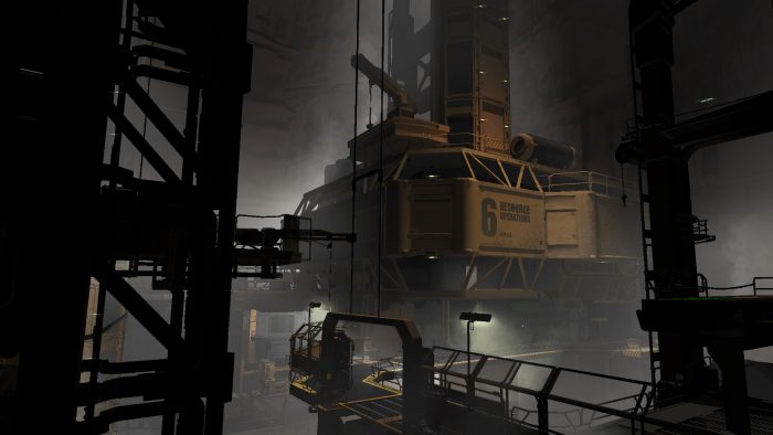
Jon Lane – Res Ops
“The look of Res Ops is partially influenced by modern oil rigs. We wanted to hint at the idea that the mining operation on Mars is huge; that there’s a large network of these types of platforms, where the workers essentially work and live entirely subterranean lives.”
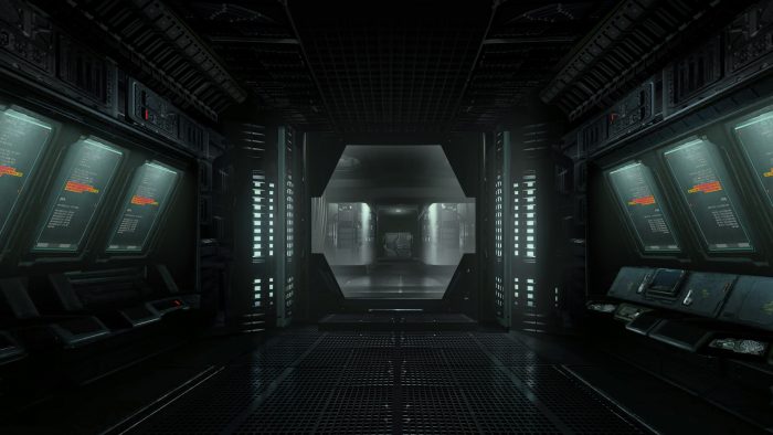
Jon Lane – Res Ops Enclosure
“This is a narrow view into part of the larger Res Ops facility. Because we’re making a game with elaborate sci-fi environments, every square-foot of space needs to be visually designed. We did hundreds of shots like these; a concept was made for nearly every room and hallway in the game.”
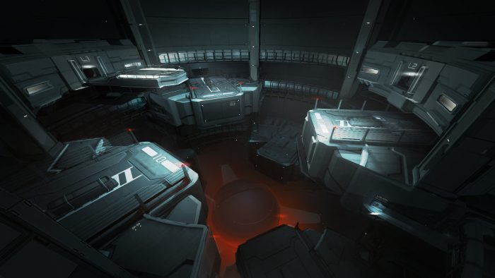
Jon lane – Lazarus
“In our fiction, Lazarus thematically represents the intersection point between science and mysticism; the point where UAC scientists discover Hell and inevitably become corrupted by its influence. In terms of player progression, the architecture of Lazarus was originally designed as a vertical descent, progressively leading the player downwards towards the Hell portal at the base of the facility.”
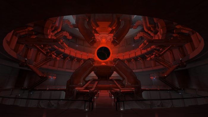
Jon Lane – Argent Interior
“This is an early concept for the interior of Argent Tower. The tower serves as one of the UAC’s key experiments into interdimensional research and exploration.”
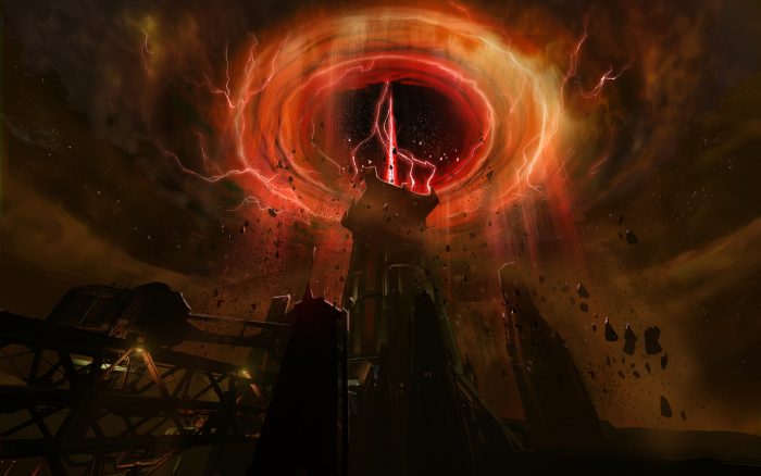
Emerson Tung – Vortex
“It was challenging to come up with a giant portal design that did not look like every other interdimensional giant portal in pop culture, but I think we ended up with one that felt pretty fresh.”
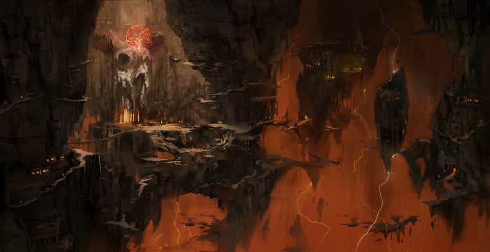
Emerson Tung – Hell (Necropolis)
“This was an early exploration for the Necropolis, which was described to me as a cavernous ruin with a bottomless pit and precarious walkways, which were inspired by the precarious mountain paths of Tianmen Mountain. I added a giant demon skull as the centerpiece as a throwback to the Icon of Sin and it stuck all the way to the end of production.”

Colin Geller – Res Ops Exterior
“This concept was to help establish the exterior architectural theme and lighting of Resource Ops. The idea here was to make the first view the player had upon entering this area a sweet vista and a view of their goal. In this case, their intended goal was the tower you can see through the V shaped support.”
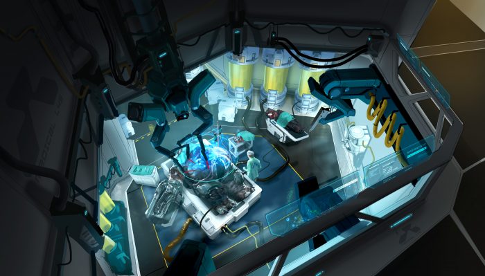
Colin Geller – Lazarus Exterior
“This was an early pass on the facility that ultimately became Lazarus. In this instance, it was hidden in a volcanic crater. It would only become visible once you made your way over the crater’s edge before entering the level. This was also an early pass on what the cleaner, scientific building style would look like from an exterior view.”
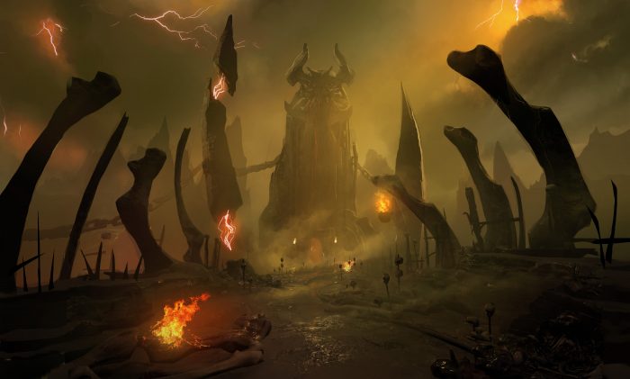
Colin Geller – Hell bridge
“This is a color and lighting pass over game geometry to establish the mood of Hell. Prior to this, a few early mood paintings were done with color palettes inspired by the work of Zdzisław Beksiński. This particular image was one of a dozen passes with subtle variations. The goal was to give the player an uncomfortable and unpleasant sense about the place. Unpleasant to the point you could almost smell the sulfur as you entered the level.”
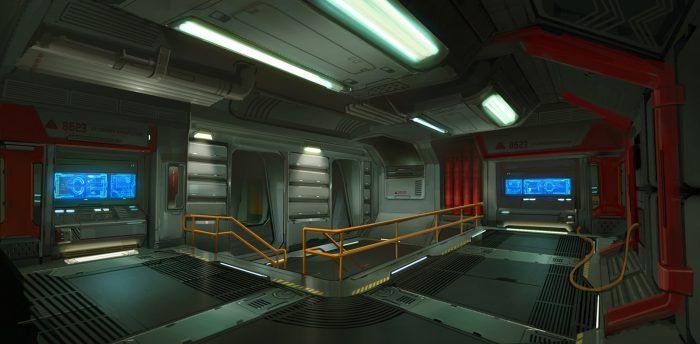
Alex Palma – Lazarus
“This is a sci-fi control room based in Lazarus. In this concept, I used some of my favorite sci-fi films as inspiration. It was the first sci-fi room I did and I very much enjoyed it.”
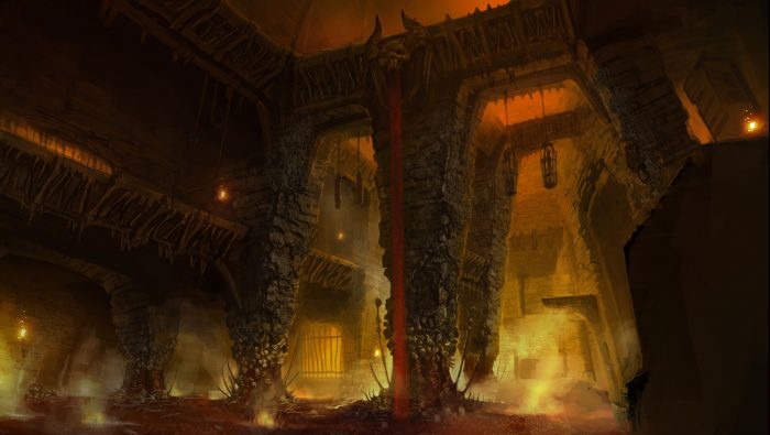
Alex Palma – Bloodkeep 2
“After doing some iteration on this level, a key word became apparent: “oppressive”. With tilted pillars, blood and guts for ground cover, and some opaque atmosphere, it became very oppressive.”
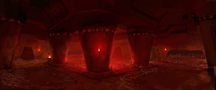
Alex Palma – Bloodkeep 3
“This piece was also inspired by using some oppressive shapes. The goal for this was to create a tomb or temple inspired environment. With the red atmosphere and oppressive round pillars, it made this part of the level very recognizable.”
